Skip to main content GitHub corner

Acorn CSS

A generative classless CSS framework built for customization

# Getting Started

A lightweight CSS framework that makes semantic HTML beautiful. Just ~18KB of thoughtful CSS.

# Installation

Via npm

Install the package from npm:

npm install acorn.css

Then import in your JavaScript/TypeScript:

// Import everything
import 'acorn.css';

// Or import specific build
import 'acorn.css/dist/acorn.css';
import 'acorn.css/dist/acorn.min.css';

Or import in your CSS:

@import 'acorn.css';

Via CDN

<link rel="stylesheet" href="https://unpkg.com/acorn.css@latest/dist/acorn.min.css">

Quick start - customize with CSS variables

:root {
  --primary: #41aaea;
  --space-2: 1rem;
  --text-base: 1rem;
  --container-default: 60rem;
  --border-radius: 0.25rem;
}

# Core Principles

  • Lightweight: ~18KB of CSS (3.8KB gzipped), no JavaScript required
  • Semantic: Style HTML elements directly without classes
  • Customizable: Simple CSS custom properties for everything
  • Accessible: WCAG compliant with proper focus management
  • Responsive: Mobile-first with sensible defaults

# Customization

Customize the framework using straightforward CSS custom properties:

--primary, --secondary, --accent
Brand colors with light/dark variants for your design system.
--space-1 through --space-5
Spacing scale using rule of 2: 8px, 16px, 32px, 64px, 128px.
--text-xs through --text-3xl
Typography scale (1.25 ratio) for consistent text sizing.
--container-narrow/default/wide
Container widths: 45rem (reading), 60rem (default), 80rem (wide).
--border-radius
Base border radius applied to buttons, inputs, and interactive elements.

Dark Mode

The framework includes built-in dark mode support using the data-theme attribute:


<html data-theme="light"> <!-- Light mode (default) -->
<html data-theme="dark">  <!-- Dark mode -->

For automatic theme detection based on user preferences, you can use CSS media queries instead:

/* Auto dark mode using prefers-color-scheme */
@media (prefers-color-scheme: dark) {
  :root {
    /* Apply dark mode colors automatically */
    --primary: #6ec3f8;
    --white: #151513;
    --black: #f5f5f5;
    /* ... other dark mode variables */
  }
}

Or implement with JavaScript to respect system preferences while allowing manual override:

// Auto mode with system preference detection
const prefersDark = window.matchMedia('(prefers-color-scheme: dark)');
const savedTheme = localStorage.getItem('theme');

if (savedTheme) {
  document.documentElement.setAttribute('data-theme', savedTheme);
} else if (prefersDark.matches) {
  document.documentElement.setAttribute('data-theme', 'dark');
}

Note: This demo uses manual theme switching with the toggle button in the bottom-right corner.
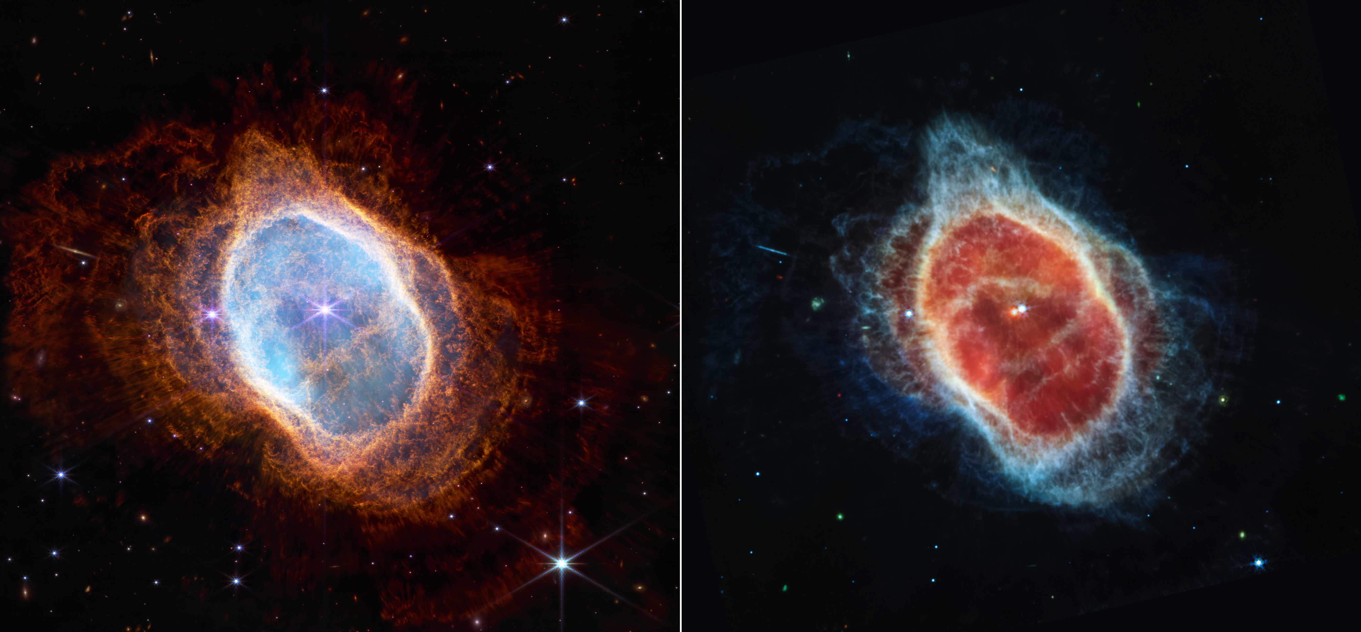
 Your implementation can choose manual control, automatic detection, or both!

# Typography

All heading and text elements styled automatically with mathematical type scale.

# Heading Hierarchy

Heading 1 - Main Title

Heading 2 - Section Title

Heading 3 - Subsection

Heading 4 - Article Title

Heading 5 - Subheading
Heading 6 - Minor Heading

# Inline Text Elements

This is a paragraph with bold text, italic text, and a link. The framework provides consistent spacing and typography that scales beautifully across devices.

You can use inline code, Cmd + C keyboard shortcuts, highlighted text, small text, and text with various other formatting options including superscript and subscript.

Additional semantic elements: HTML, definition terms, variables, , and inline quotations.

# Blockquotes

The best frameworks get out of your way and let you focus on content. This blockquote demonstrates how semantic HTML just works.

Framework Philosophy

# Lists and Definitions

Unordered and ordered lists work perfectly:

  • Automatic styling for list items
  • Proper spacing and indentation
    • Nested lists work too
    • Multiple levels supported
  • Mobile-friendly responsive design
  1. Install the framework
  2. Write semantic HTML
  3. Customize with CSS variables
Classless Framework
A CSS framework that styles HTML elements without requiring class names.
Generative Design
A system where changing one parameter affects the entire design systematically.
Container Queries
CSS feature allowing styles based on container size rather than viewport size.

# Layout & Sectioning

Semantic HTML5 sectioning elements with responsive container behavior.

# Container System

The framework provides four container widths:

  • data-container="text" - 720px optimal reading width
  • data-container="max" - 1200px max content width
  • data-container="wide" - 1440px wide layouts
  • data-container="full" - 100vw full viewport

# Content Flow Utilities

Stack and cluster utilities for content organization:

Content flow uses default margin-bottom spacing for consistent vertical rhythm.

# Wide Container Section

This section uses data-container="wide" to break out wider than normal content. Perfect for showcasing images, data visualizations, or content that needs more breathing room.

# Interactive Elements

Modern HTML5 interactive elements with built-in accessibility.

# Disclosure Widgets

What makes this framework different?

Unlike utility-first frameworks, Acorn is designed to style semantic HTML out of the box. You write markup the way it was intended, and the framework makes it look great.

How does the generative system work?

The framework uses mathematical relationships to generate entire color palettes, spacing scales, and typography hierarchies from just 5 core variables. Change the hue from 210 to 160, and your entire site shifts from blue to green while maintaining perfect color relationships.

Can I customize everything?

Absolutely! While the framework provides sensible defaults, every aspect can be customized through CSS variables. The generative approach means your customizations propagate throughout the entire system automatically.

# Progress Indicators

Upload progress: 67%

Storage usage: 60% used

Disk space: 85% used

Battery level: 15% remaining

# Dialog Example

Example Dialog

This is a native HTML dialog element styled by the framework. It includes backdrop blur and proper focus management.

# Interaction State

Loading state: Processing...

Success state: ✓ Saved successfully

Error state: ✗ Something went wrong

# Forms

Complete form styling with accessibility and mobile-first design.

# Complete Form Example

Contact Information
Preferences
Interests
Newsletter

# Button Variants

Standard Variants

Disabled States

Destructive Actions

# Inline Form Layout

# Tables

Responsive tables that transform into cards on mobile using container queries.

# Basic Table

Basic Table Example
Name Role Location
John Doe Developer New York
Jane Smith Designer San Francisco
Bob Johnson Manager Chicago

# Mobile-Responsive Table

Framework Comparison
Framework Type Size (gzipped) Features
Acorn CSS Classless ~8KB Generative design, container queries, accessibility
Tailwind CSS Utility-first ~15KB Utility classes, customization, JIT compilation
Bootstrap Component-based ~25KB Components, grid system, JavaScript plugins

# Media Elements

Images, video, and embedded content with responsive behavior.

# Responsive Images

Images are responsive by default and can be sized using data attributes:

Carina Nebula captured by James Webb telescope
The Carina Nebula as captured by the James Webb Space Telescope. NASA, ESA, CSA, and STScI

# Image Alignment Options

Images can float left or right on larger screens: Square crop of Carina Nebula This text wraps around the right-aligned image on desktop but stacks normally on mobile devices. The framework handles this responsive behavior automatically using container queries.

Anim, nisi ad pariatur. Pariatur exercitation adipiscing tempor est amet aute. Adipiscing tempor est amet, aute dolor. Amet aute dolor enim anim est esse. Dolor enim anim est, esse laborum sint. Est esse laborum sint, id. Sint, id duis ea cupidatat. Ea cupidatat qui non sed sed proident. Qui non sed, sed proident. Sed proident sed elit ad.

Left-aligned images work similarly: Square crop of Carina Nebula The image floats to the left on larger screens while maintaining proper spacing and readability.

Commodo occaecat sed aute eiusmod, et culpa. Aute eiusmod et culpa magna cupidatat tempor consectetur. Et culpa magna cupidatat tempor, consectetur. Cupidatat tempor consectetur elit ut. Consectetur elit ut eiusmod nisi exercitation. Ut eiusmod nisi exercitation fugiat incididunt, est ex. Exercitation fugiat incididunt est ex. Incididunt est ex cupidatat irure non ex ex. Ex cupidatat irure non ex ex. Irure non ex ex aliquip nisi.

Center-aligned images work similarly: Square crop of Carina Nebula The image is centered on larger screens while maintaining proper spacing and readability.

Lorem ipsum dolor sit amet, consectetur adipiscing elit. Amet aute dolor enim anim est esse. Dolor enim anim est, esse laborum sint. Est esse laborum sint, id. Sint, id duis ea cupidatat. Ea cupidatat qui non sed sed proident. Qui non sed, sed proident. Sed proident sed elit ad.

Lorem ipsum dolor sit amet, consectetur adipiscing elit. Amet aute dolor enim anim est esse. Dolor enim anim est, esse laborum sint. Est esse laborum sint, id. Sint, id duis ea cupidatat. Ea cupidatat qui non sed sed proident. Qui non sed, sed proident. Sed proident sed elit ad.

Stellar death captured by Webb telescope
Full-width image using data-align="full". NASA's Webb Captures Dying Star's Final Performance

# Media Gallery

Use data-gallery for responsive image grids:

Carina Nebula Carina Nebula square crop Stellar death Carina Nebula inverted Carina Nebula Carina Nebula square crop

# Video and Audio

Video elements with responsive aspect ratios:

Audio elements for podcasts and music:

Carina Nebula responsive image
Responsive picture element with art direction

# Documentation

Simple grid system demo.

# Documentation

Complete guides and API reference coming soon.

# Coming Soon

  • Installation Guide: npm package, CDN links, and direct download
  • Customization Docs: Complete variable reference and examples
  • Component Library: All available patterns and data attributes
  • Migration Guide: Moving from other frameworks
  • Advanced Usage: Extending the framework and building themes

# Resources

Essential links and references:

# Community

Connect with other developers using Acorn CSS:

Frequently Asked Questions
Why classless?
Classless frameworks let you focus on semantic HTML while providing beautiful defaults. Perfect for prototypes, documentation sites, and projects where you want to write less CSS.
How does the generative system work?
Mathematical relationships generate entire design systems from 5 core variables. Change one hue and get a complete color palette with proper contrast ratios automatically.
Is it accessible?
Yes! The framework follows WCAG guidelines with proper focus states, semantic markup requirements, and support for assistive technologies.
Can I use it with JavaScript frameworks?
Absolutely! Since it's classless, it works with any framework - React, Vue, Svelte, or vanilla HTML.

Follow the GitHub repository for updates and release announcements.